Atom design system — Service Victoria
Platforms — Figma & Confluence
Expertise — UX Design, UI Design & DesignOps
How might we create a scalable, accessible, and efficient design system that ensures consistency across Service Victoria’s digital services while reducing friction for designers, developers, and end users?
Building a scalable and accessible design system
Why this mattered… Having worked in both small and large organisations, I’ve seen firsthand how a well-structured design system reduces friction, improves collaboration, and ensures consistency at scale. Beyond its functional benefits, I’ve always been drawn to design systems because they challenge you to think systematically while allowing creativity in how they evolve.
At Service Victoria, the need for a robust design system was clear—our digital services were growing, and we needed a foundation that could scale while maintaining a seamless user experience.
My role & the challenges we faced
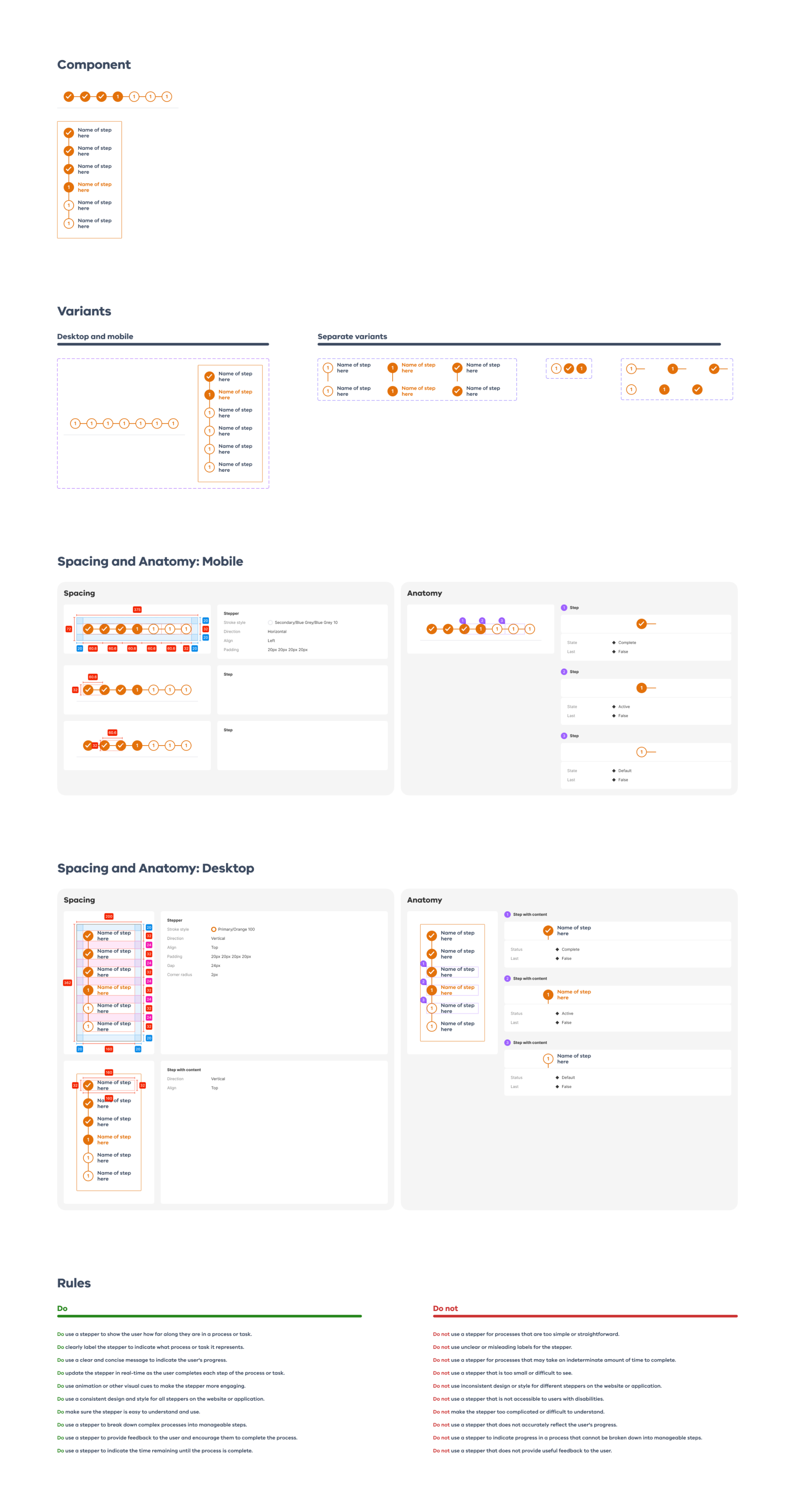
My role was to design, refine, and establish a design system that supported both VPS goals and Service Victoria’s broader objectives. The challenge was more than just creating a UI library—it was about building a framework that teams could trust, adopt, and contribute to.
Key challenges we faced:
Inconsistent user experiences – Different services had varying visual styles and interactions, leading to confusion.
Inefficient design and development – Siloed teams were duplicating work, slowing down delivery.
Scalability issues – As the platform grew, maintaining consistency became increasingly complex.
Adoption and governance – A design system only works if teams actively use and maintain it.
The approach: Structure before scale
Before diving into component design, we needed to define the philosophy, structure, and governance of our system. Through workshops, audits, and design leader engagement, we shaped a framework that was scalable, accessible, and practical.
Taking Stock – We audited existing UI patterns, design practices, and development constraints to understand our starting point.
Organising & evaluating – We sorted through what worked, what didn’t, and what could be improved.
Selecting champions – We identified key advocates across teams to drive adoption and ensure the system met real-world needs.
Refining the framework – We structured the design system around core principles that made it scalable and practical.
Aligning with VPS & Service Victoria Goals – This ensured executive buy-in and long-term sustainability.
Defining our guiding principles – These became the north star for how we designed, built, and maintained the system.
Key wins & impact
One of the most significant moments was when teams organically adopted the system. Instead of being an optional resource, it became essential to their workflow, securing ongoing executive buy-in.
Measurable impact (Jan–March 2025)
200,000+ component insertions across multiple Figma projects.
3,300+ hours saved in redundant design work.
$200,000+ in cost savings, purely from increased efficiency.
Reduced development time and QA issues by providing clear, consistent design patterns.
Beyond the numbers, the real value of the design system was how much smoother and faster teams could work—instead of reinventing the wheel, they could focus on solving real user problems.
Looking back
Building this design system wasn’t just about components—it was about fostering collaboration, efficiency, and long-term thinking. By creating a framework that could evolve with Service Victoria’s needs, we ensured that teams could design and develop with confidence, clarity, and consistency.
This wasn’t just a project; it became an integral part of how Service Victoria delivers digital services.
